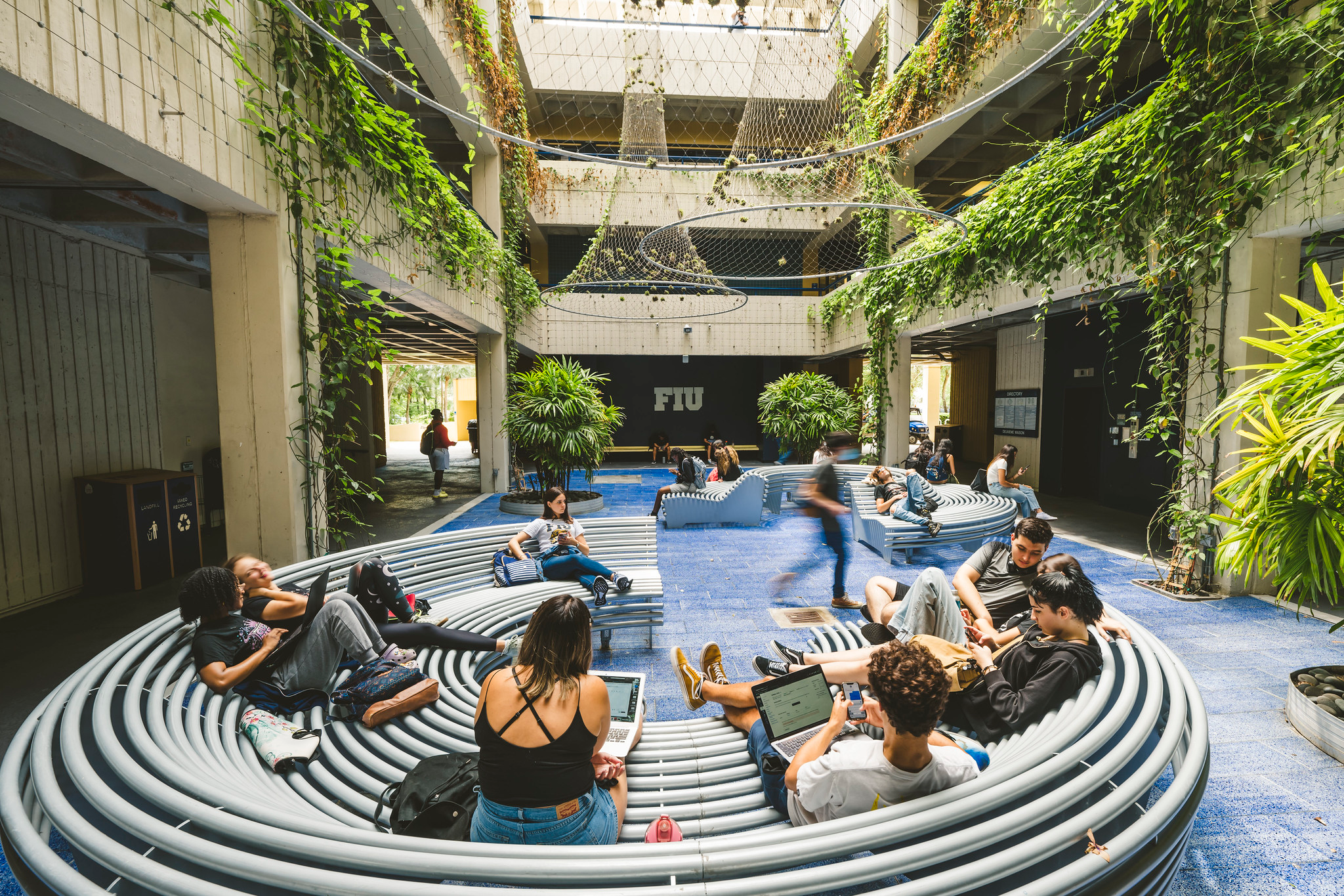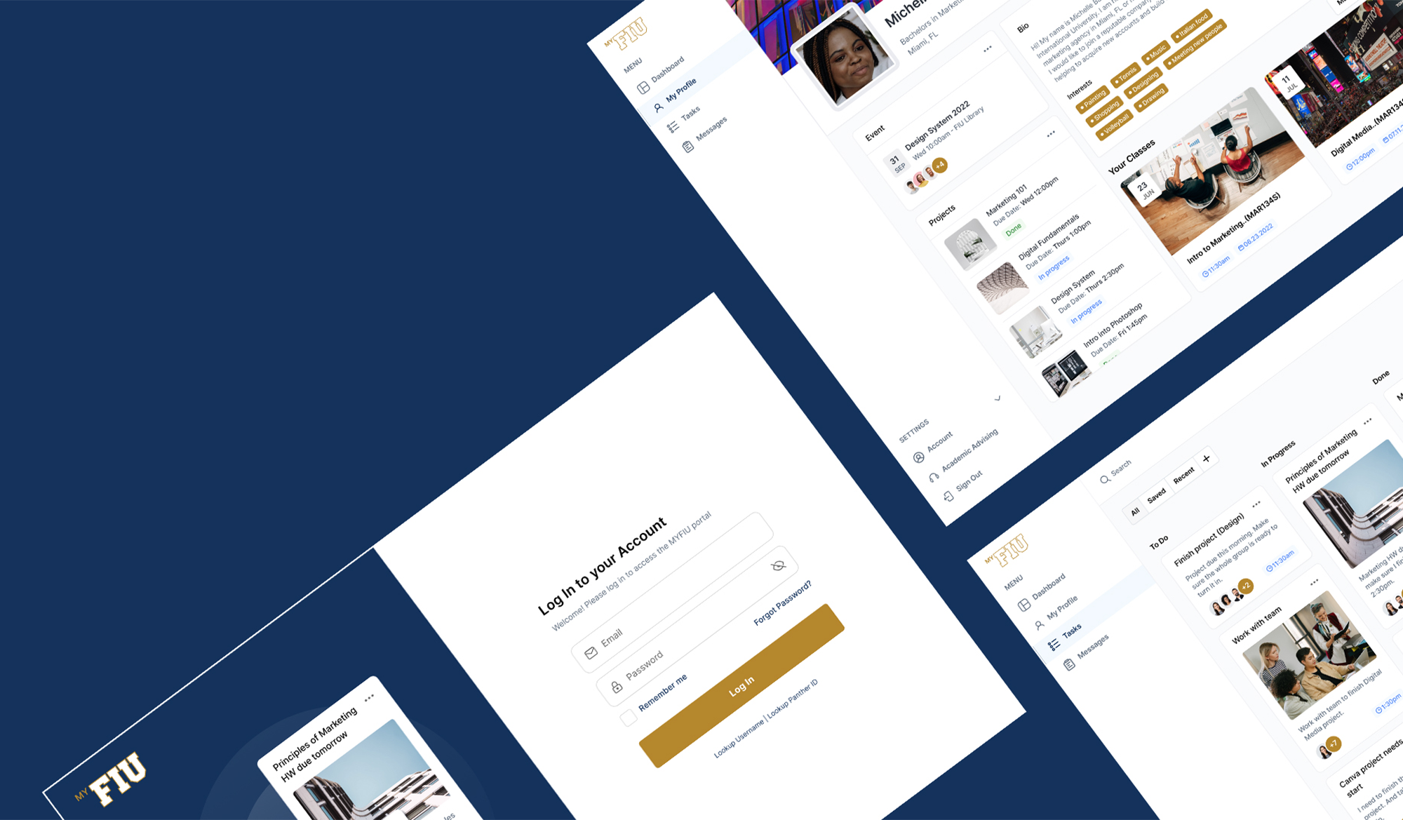
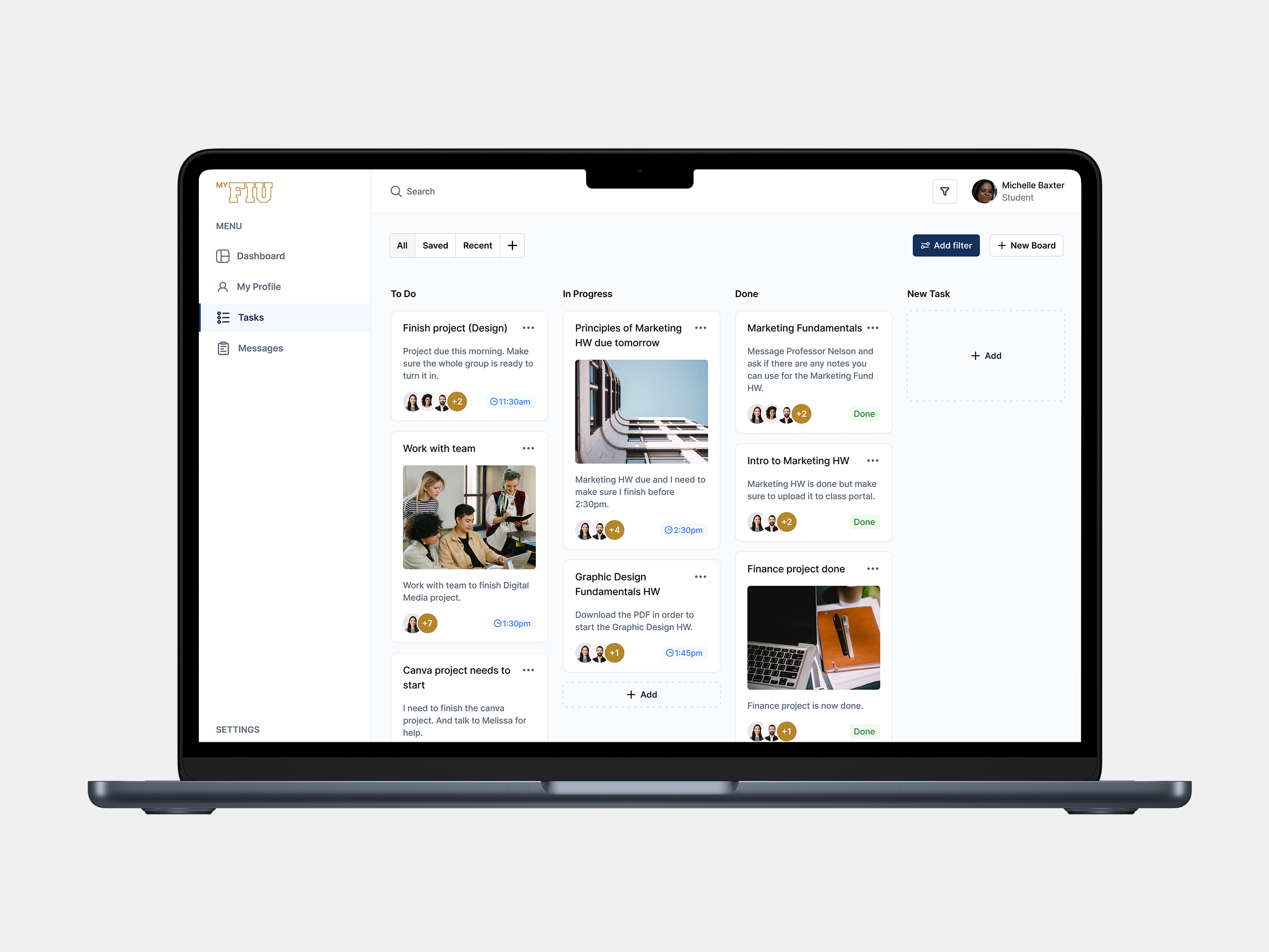
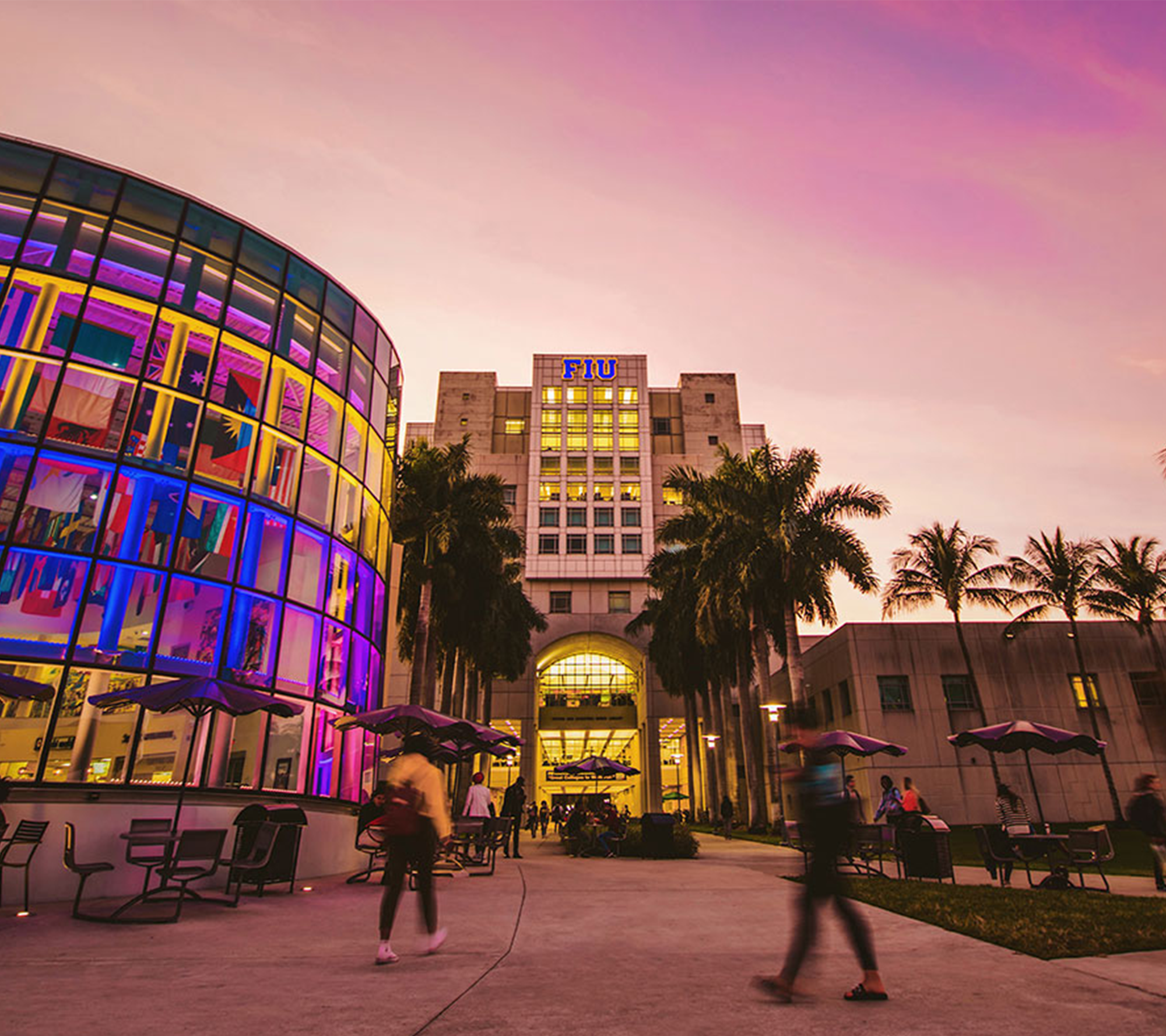
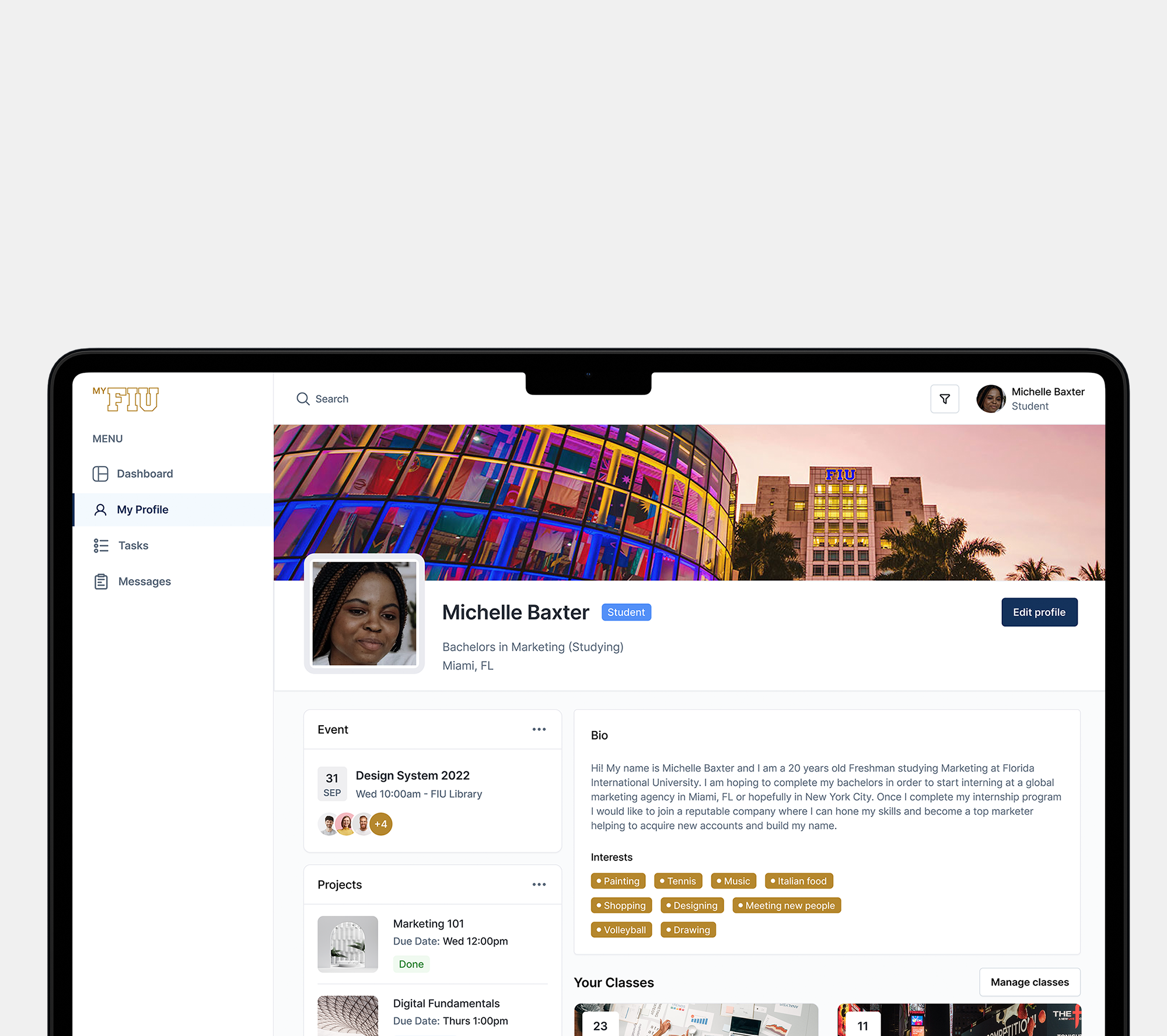
For FIU students, the main source for academics, class schedules, financial aid and assignments is the MYFIU portal. Unfortunately, the portal has been plagued with a history of outdated features, a confusing onboarding experience and a dashboard that was unnecessarily difficult to navigate, leading to high bounce rates and dropoffs. By focusing the redesign on four core features — Login, Student Dashboard, Tasks, and Messaging — the goal was to strip away complexity and create an experience that's intuitive, engaging, and worth coming back to.
Company:
Florida International University
Contributions:
UX/UI Design
Visual Design
Role:
UX/UI Designer


The Problem
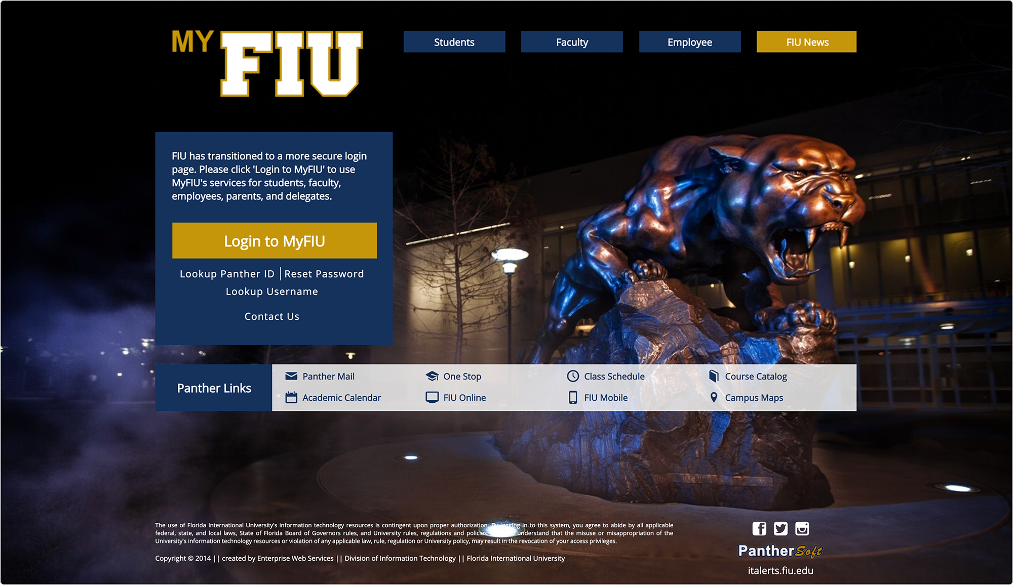
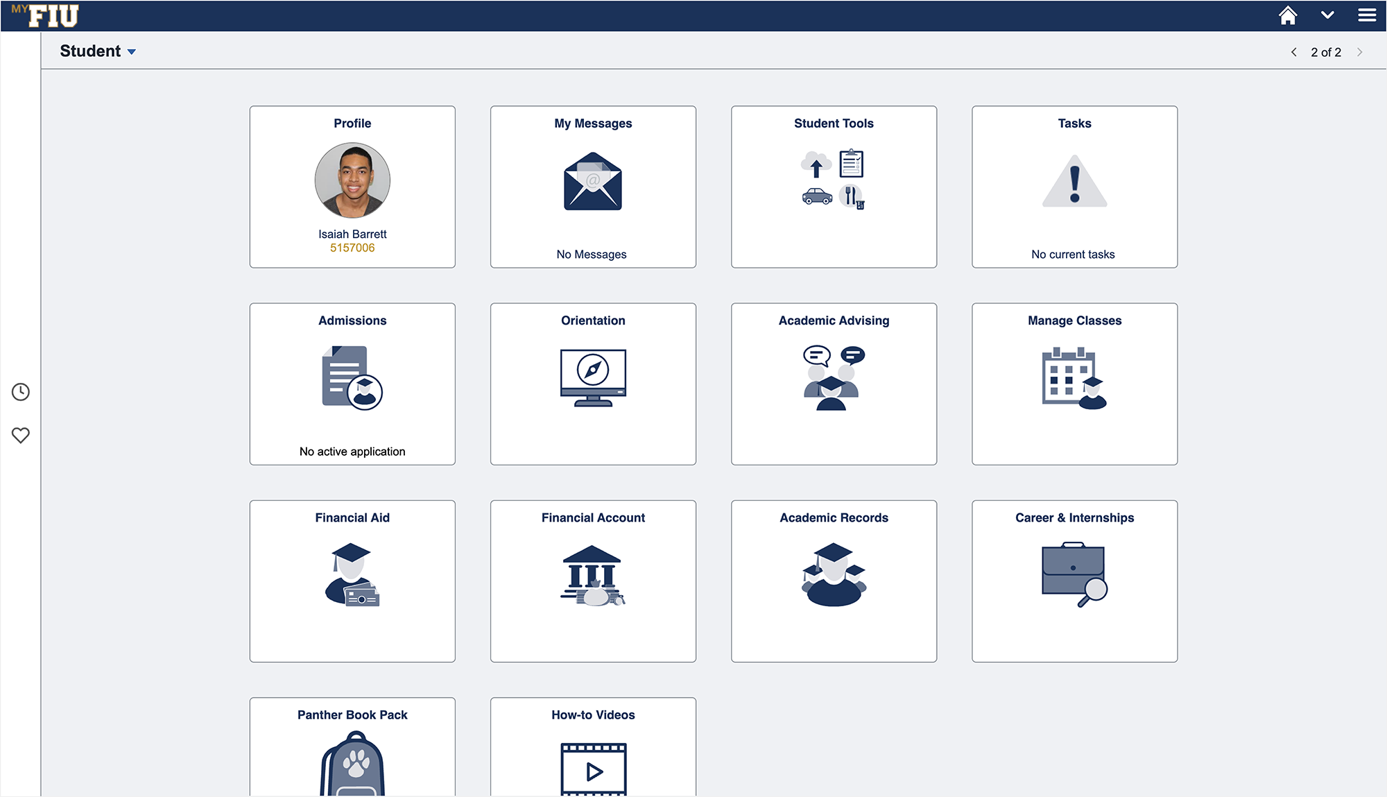
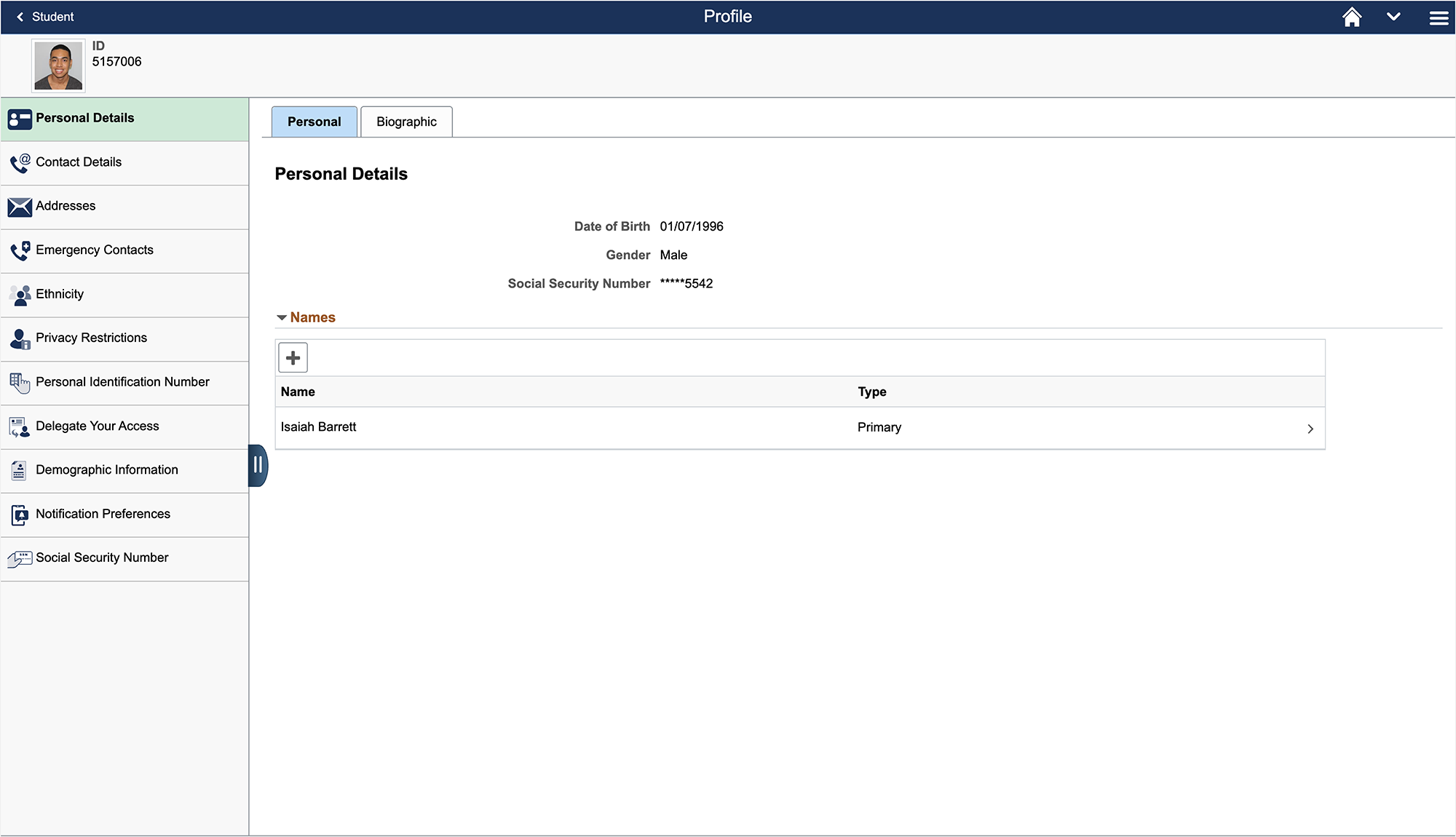
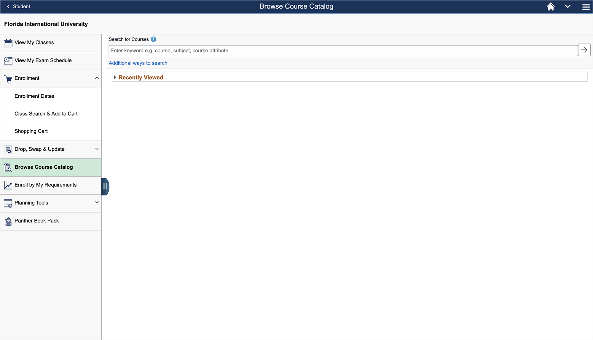
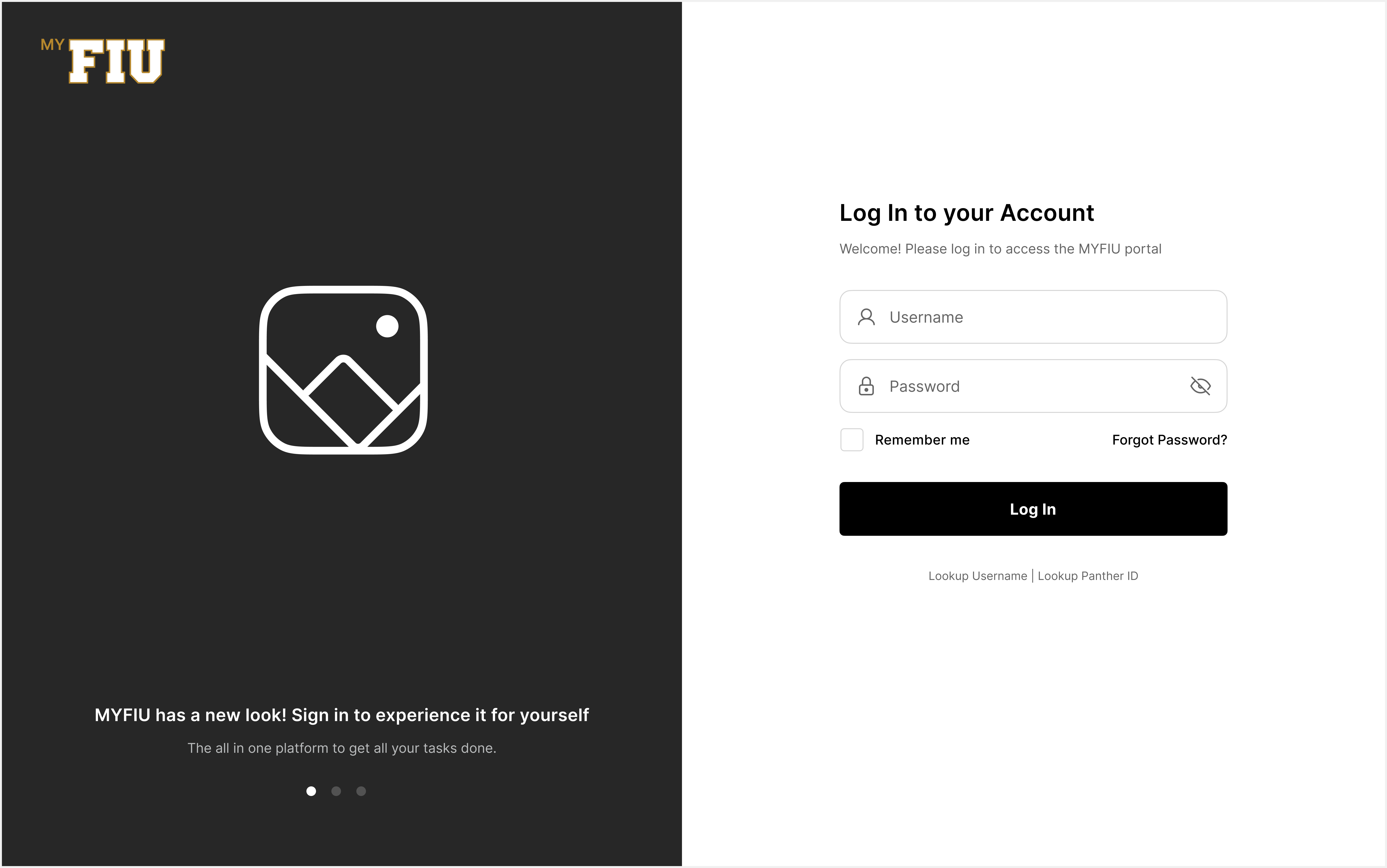
Prior to this redesign, the MYFIU portal had a wide array of usability issues that included broken features, a confusing login experience, duplicate menus and messaging bugs (see images below). Due to these problems, students at the university were not able to complete simple daily assignments, choosing classes, gathering financial aid resources and messaging their professors.
The Goal
To reimagine and redesign the MYFIU Student Portal by enhancing the overall experience for students, providing them with a user-friendly, intuitive, and personalized platform that serves as a central hub for accessing academic resources, classes, and engagement with their teachers and fellow students. By completing this redesign, the goal was also to increase conversion rates, and reduce bounce rates throughout the main features of the portal, like the Login page, Main Dashboard, Tasks and Messaging.
User Research
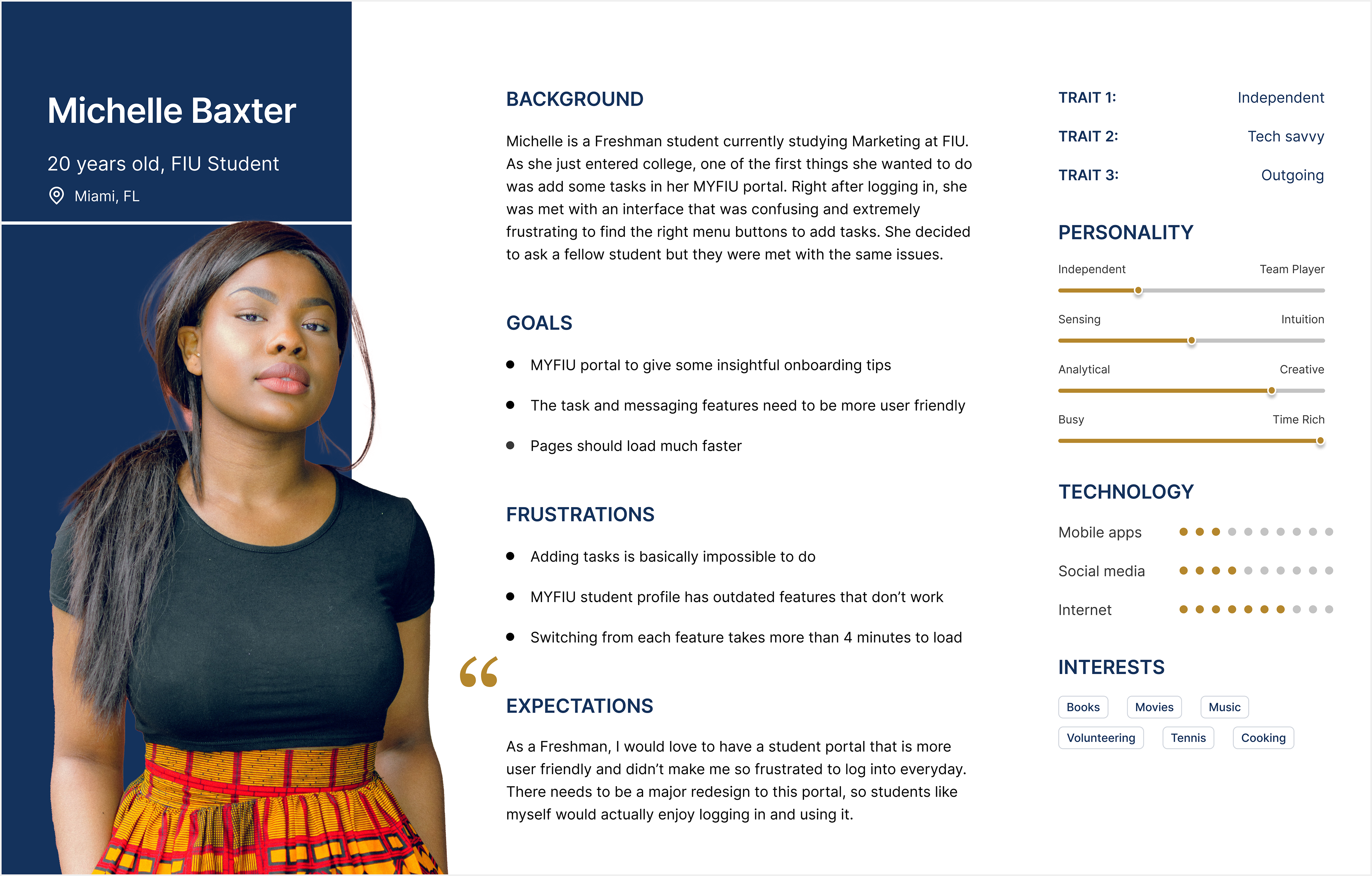
The user research focuses on understanding user behaviors, needs, and motivations through observation techniques, interviews, and other feedback methodologies. For this redesign, I wanted to understand the frustrations and pain points that FIU student's were facing when they navigated through the MYFIU portal. I started by conducting more than 25 interviews throughout the university asking a wide range of questions to obtain significant insights from students. As well as creating user personas that would then represent the FIU student body (see graphics below).
Wireframes
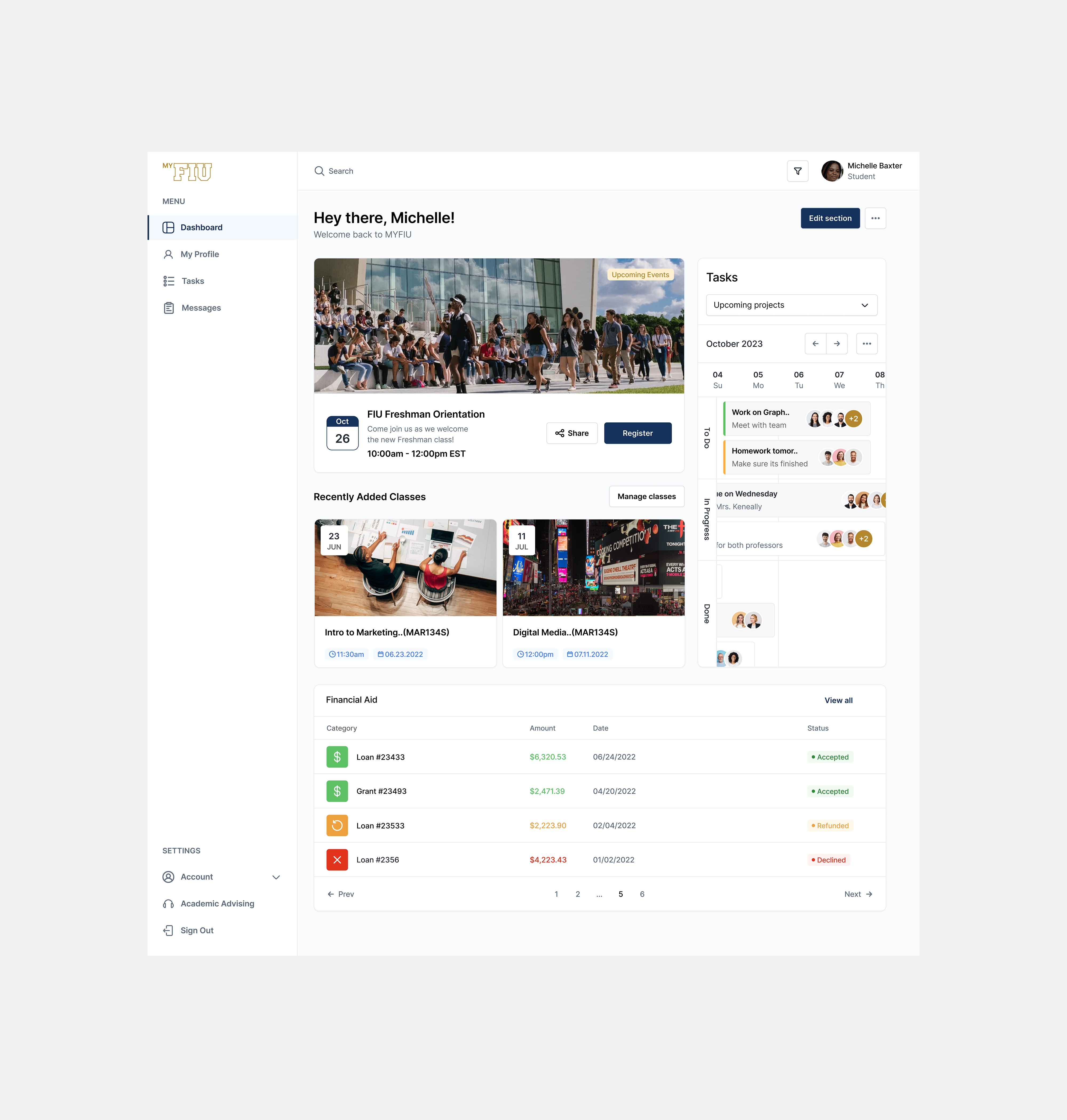
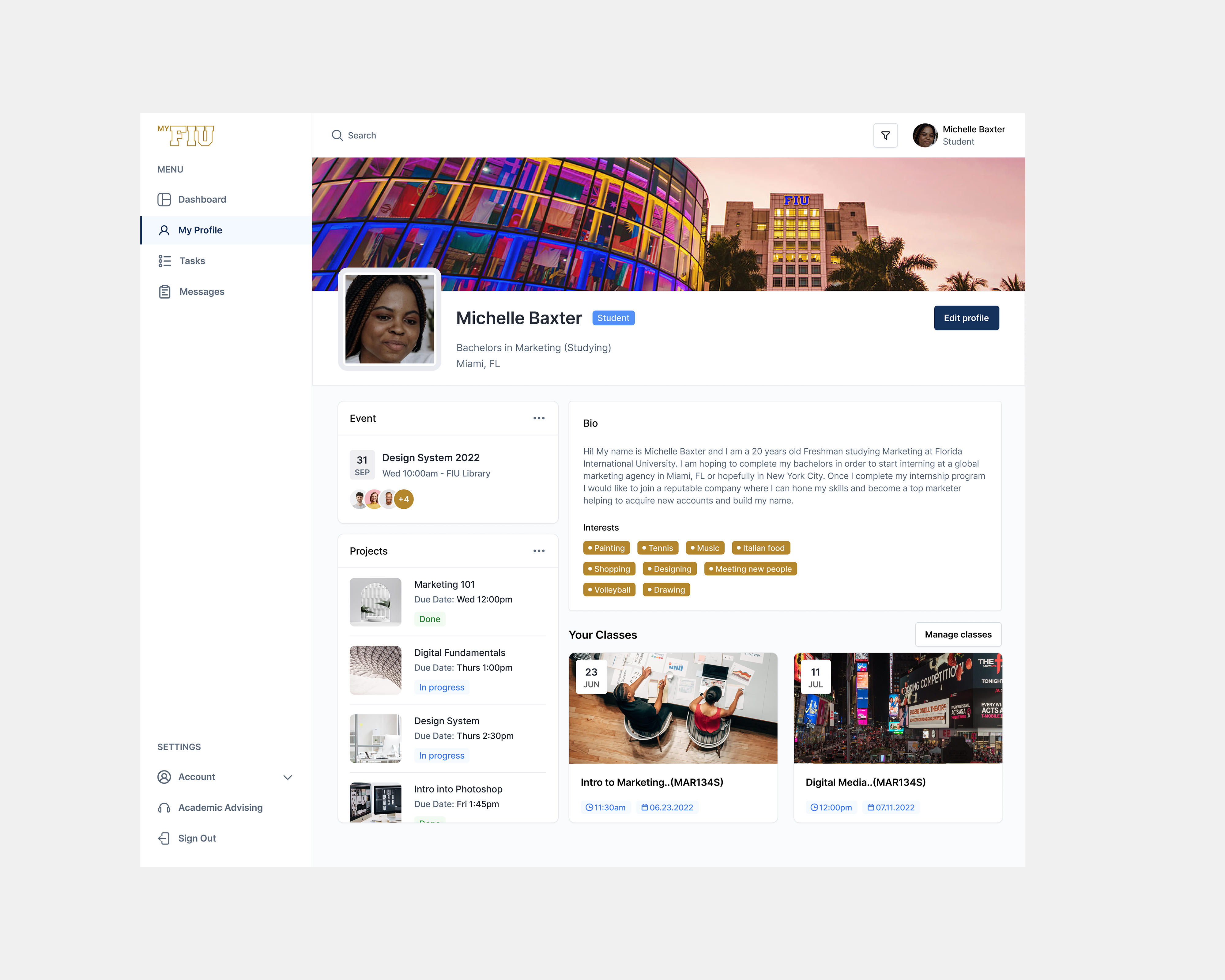
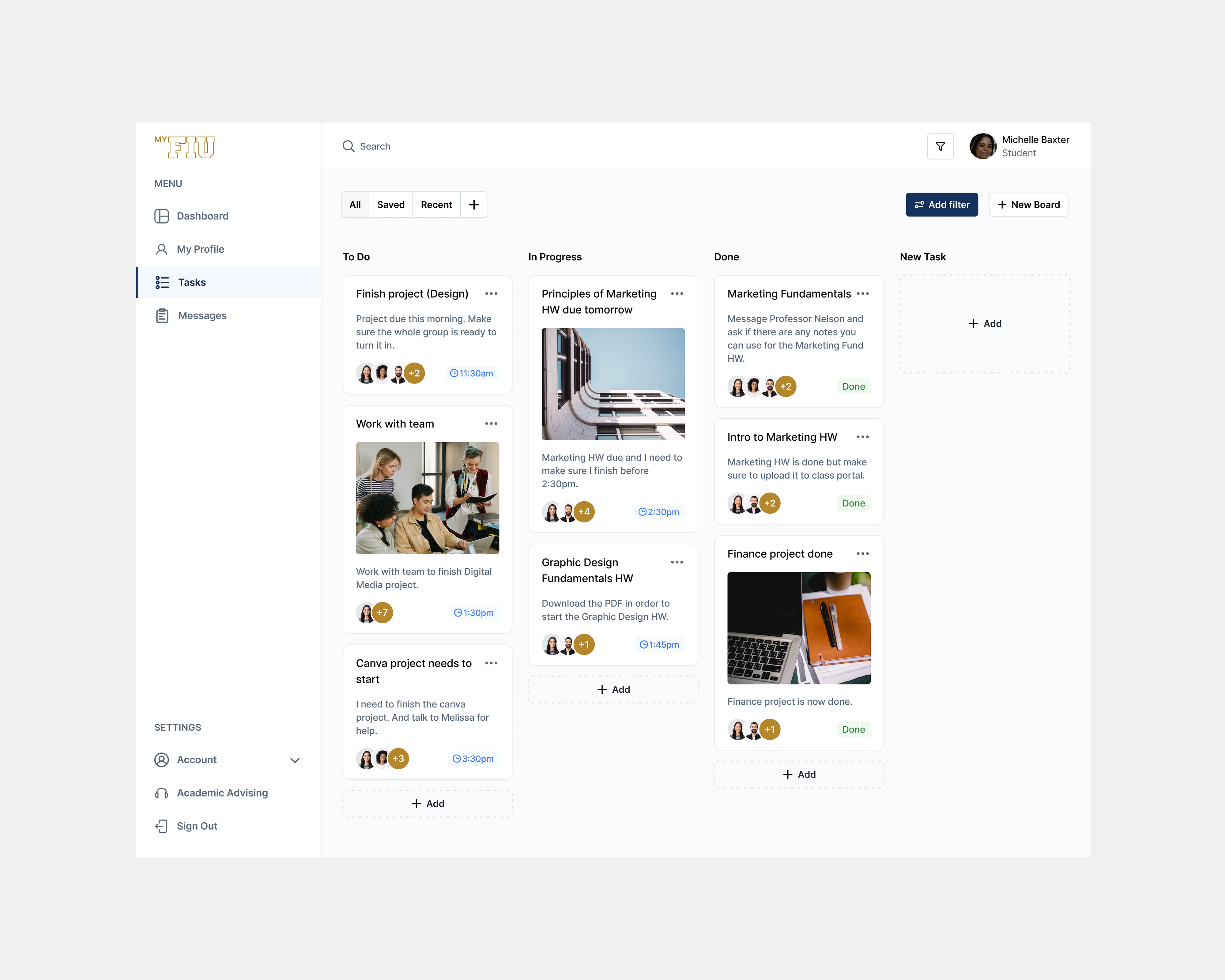
After completing the user research phase and gathering all the valuable information that student's provided me with, I was able to start designing the initial wireframes for the new redesign of the MYFIU portal. The wireframes consisted of the main features that students were more frustrated with: Login, Dashboard, Student Profile, Tasks and Messaging.
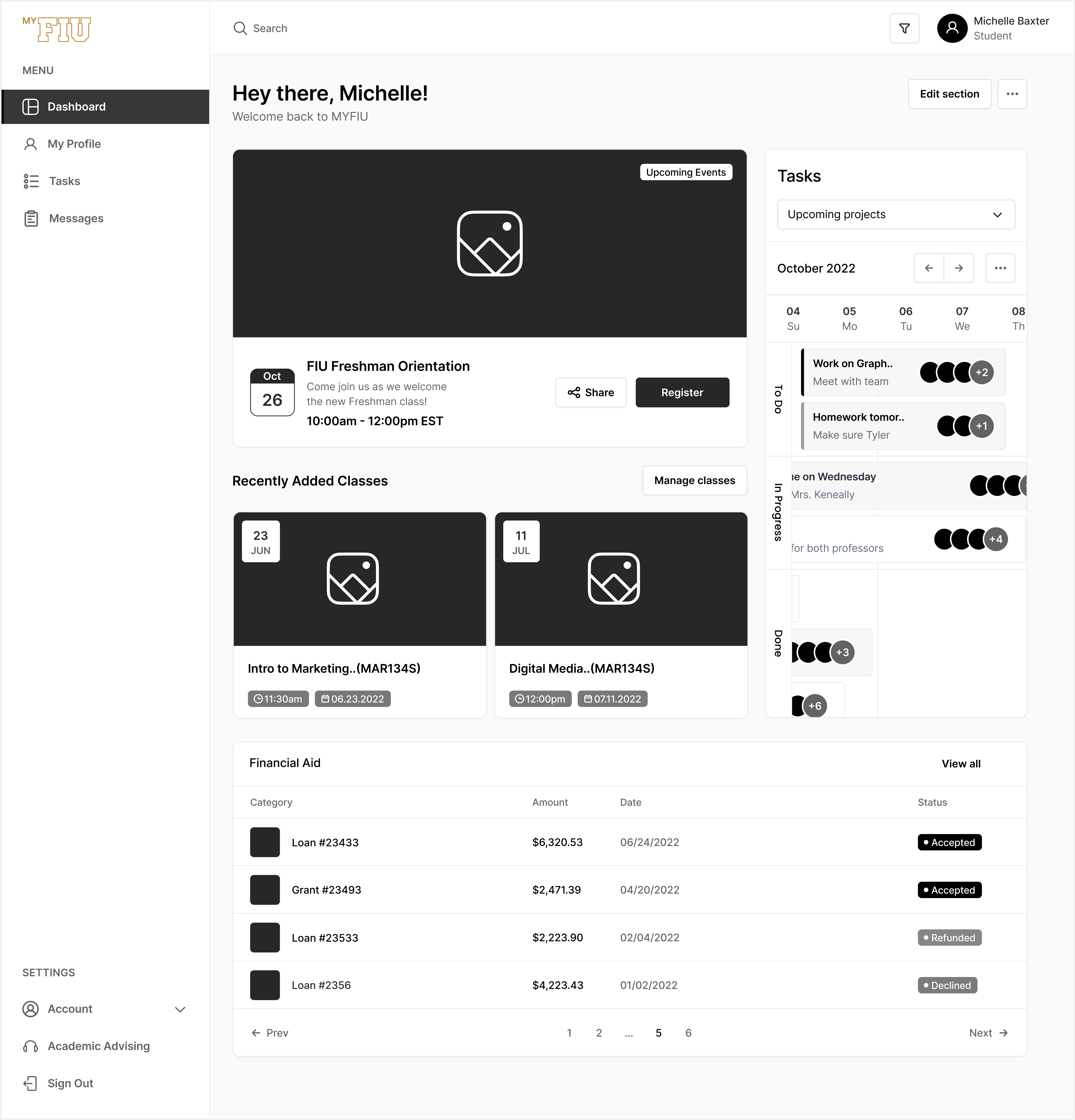
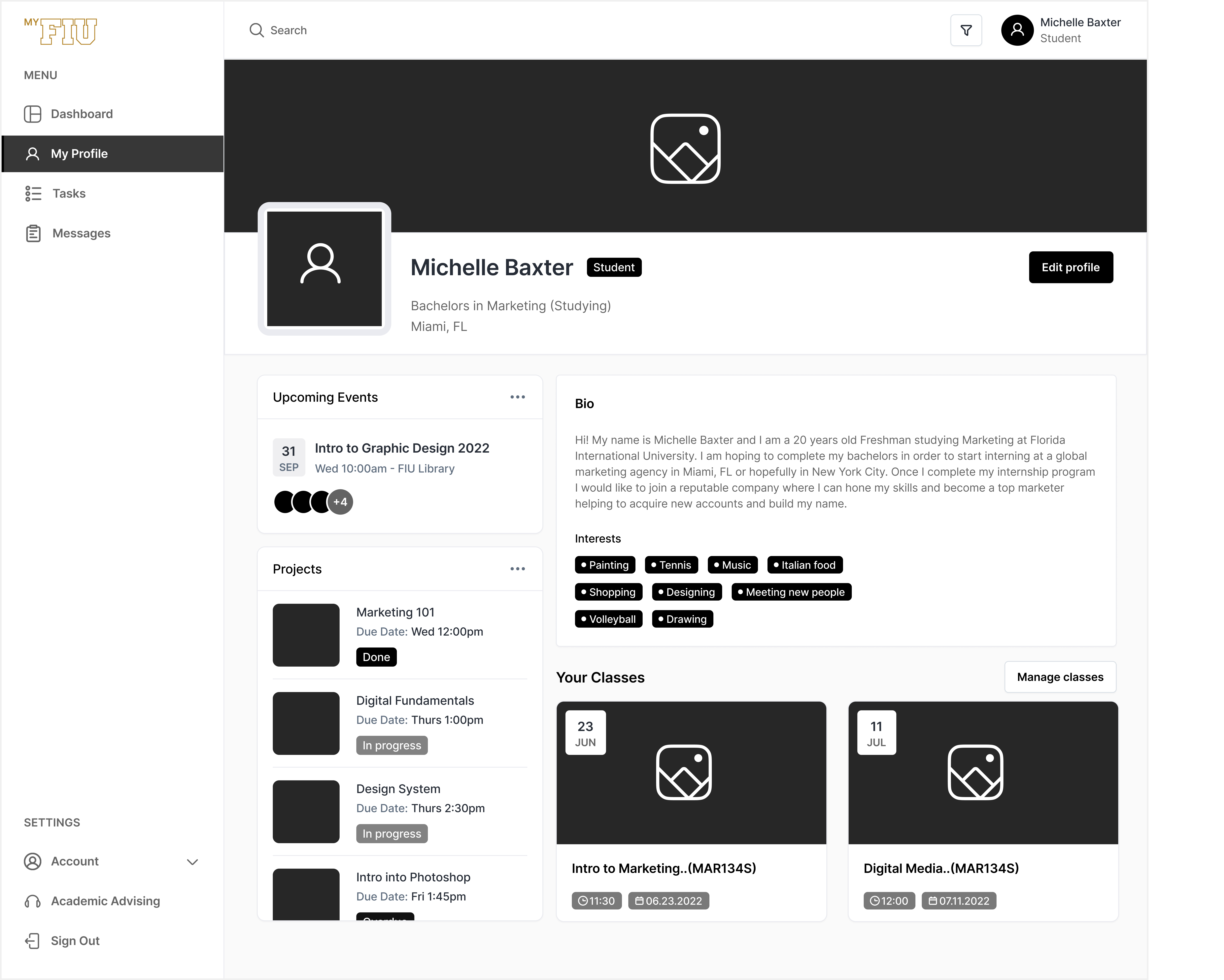
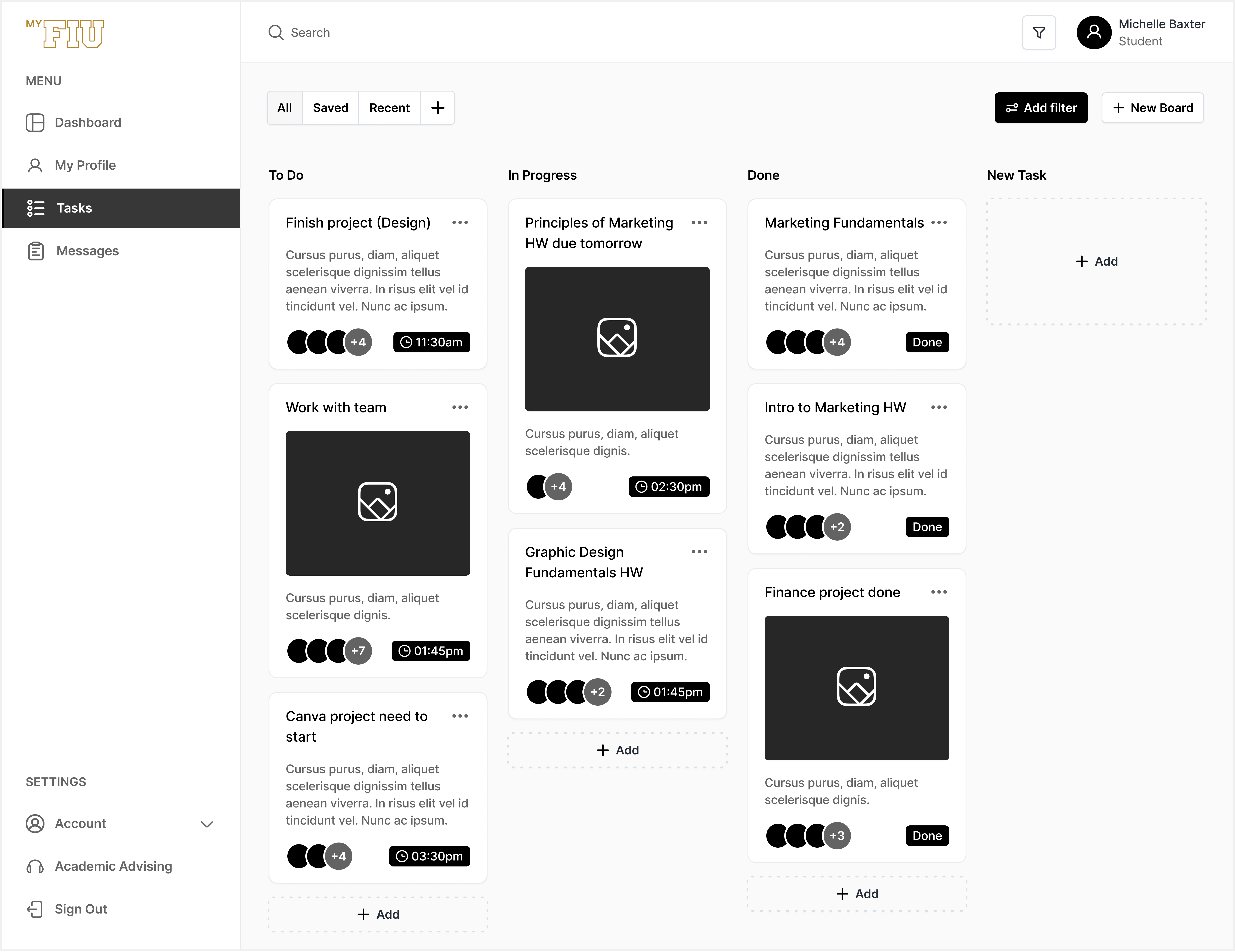
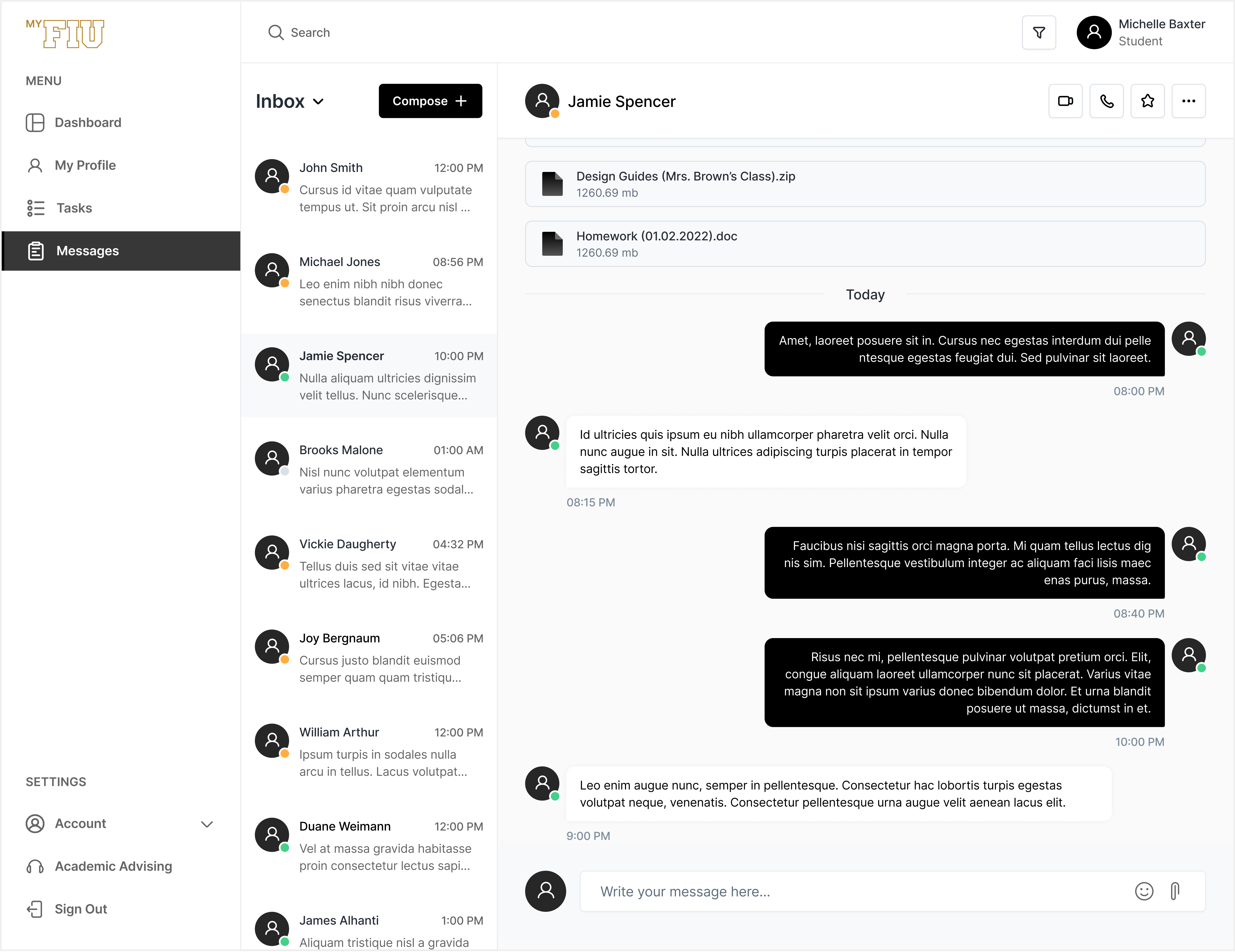
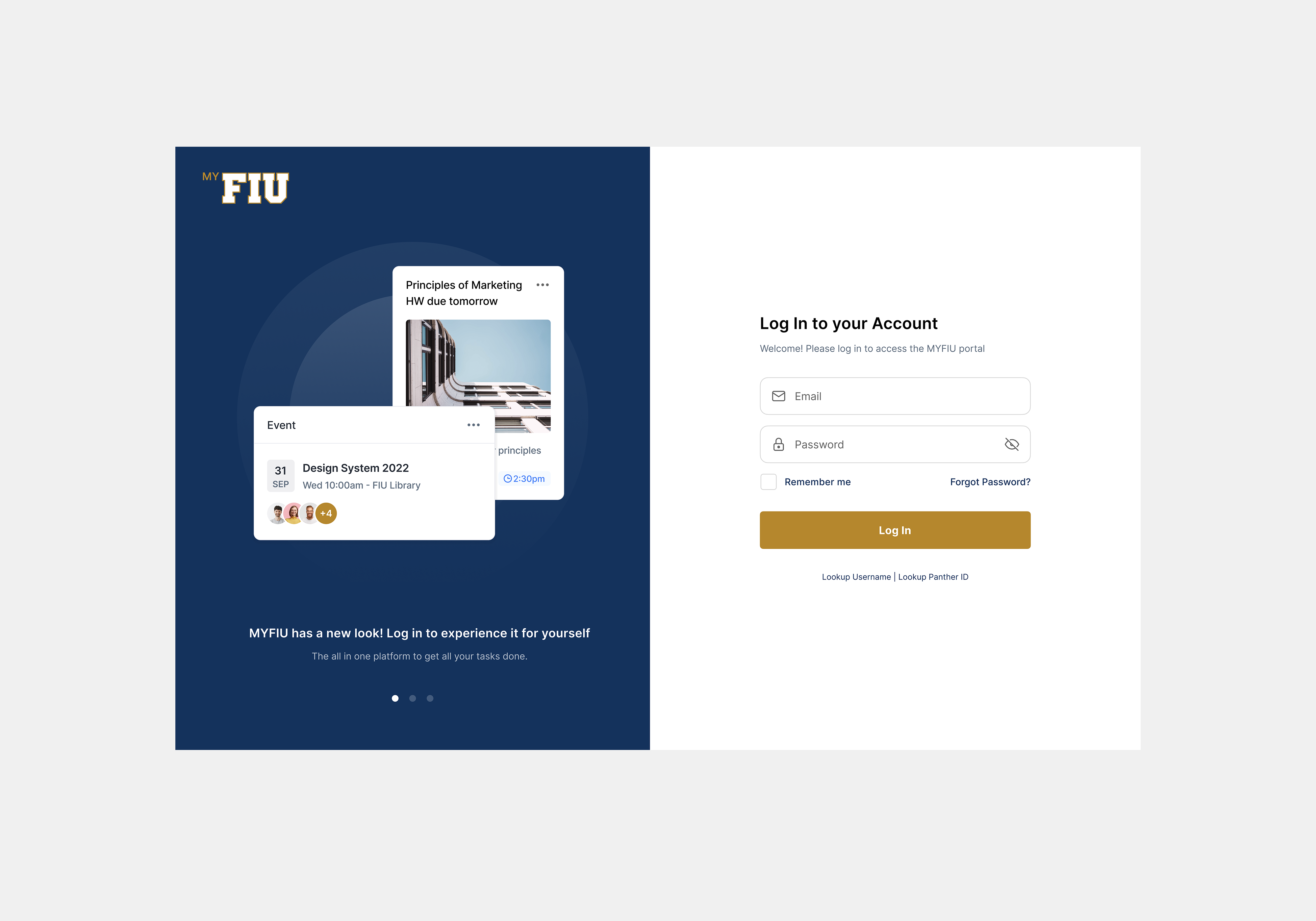
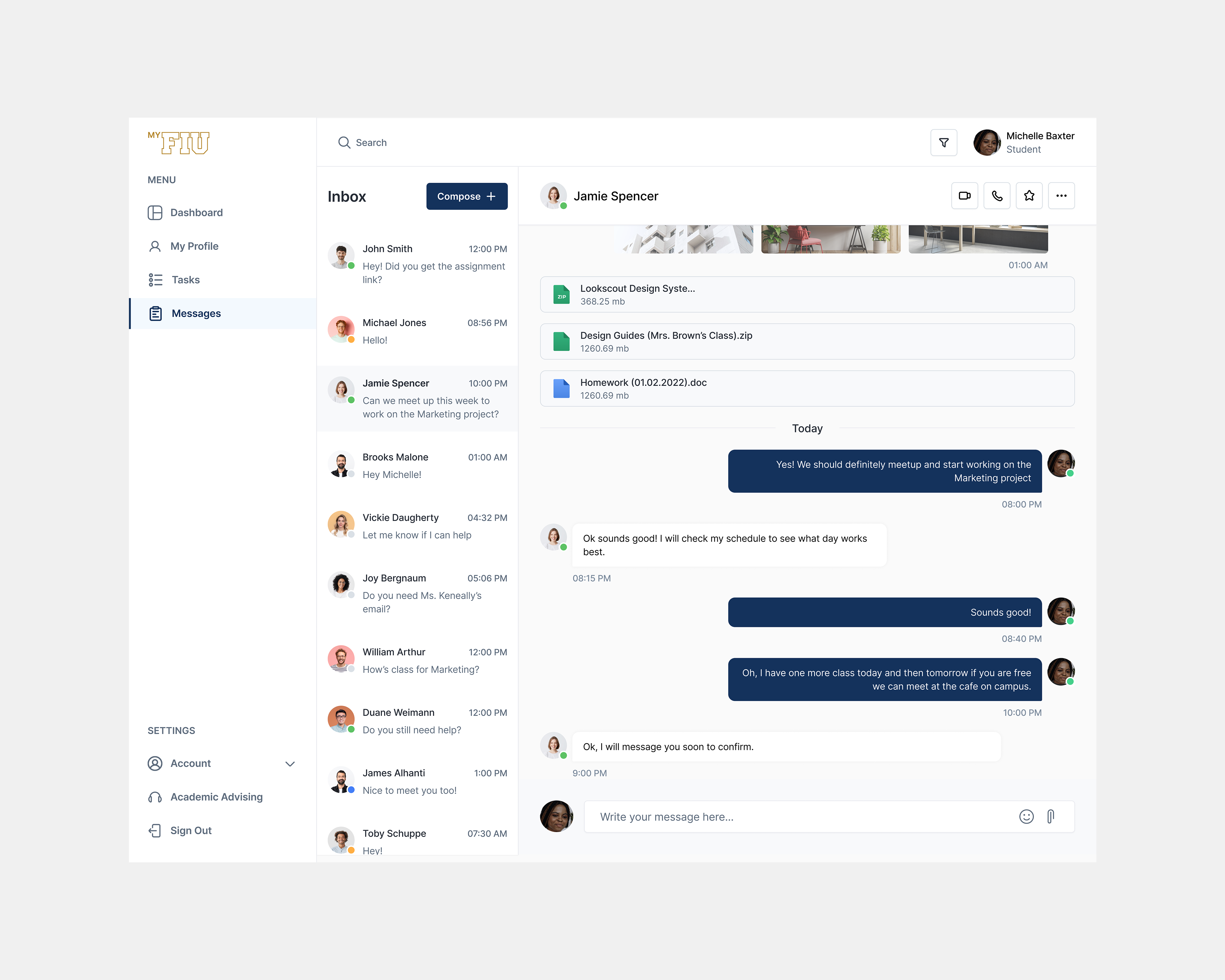
UI Design
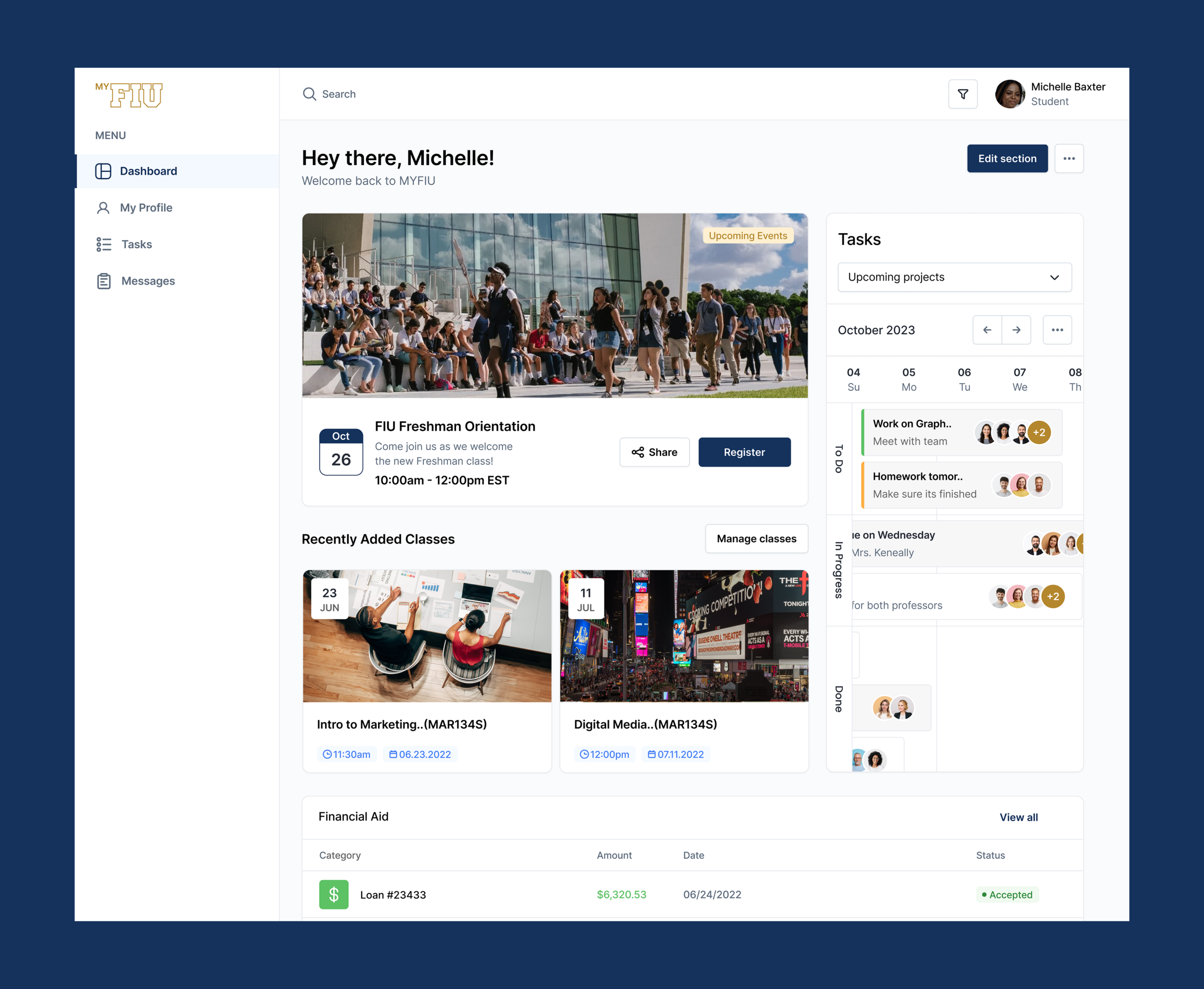
With the wireframes finalized, high-fidelity visual design was applied elevating each screen with polished, eye-catching interfaces that stays true to FIU's brand identity, while delivering a significantly more user-focused and engaging experience for students.
The Impact
After launch, the new MYFIU portal received positive feedback from students and faculty since it delivered the essential features that they needed in a way that was easy and enjoyable. After the first six months, the post launch success metrics showed a daily active user increase of 10,500 users from its previous 2,500. A bounce rate of 37% from its previous 63% and a user retention rate of 68%. This redesign really showed the importance of listening to the frustrations, needs, and goals that students brought up constantly. By empathizing and understanding what was vocalized, this redesign truly impacted the day to day lives of FIU students in a positive way.